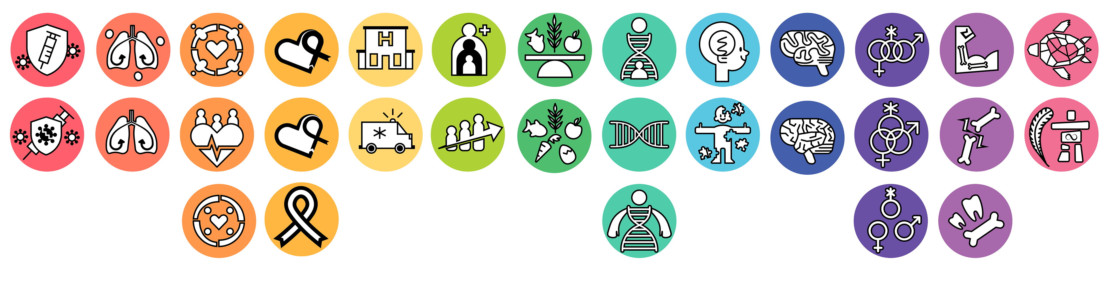
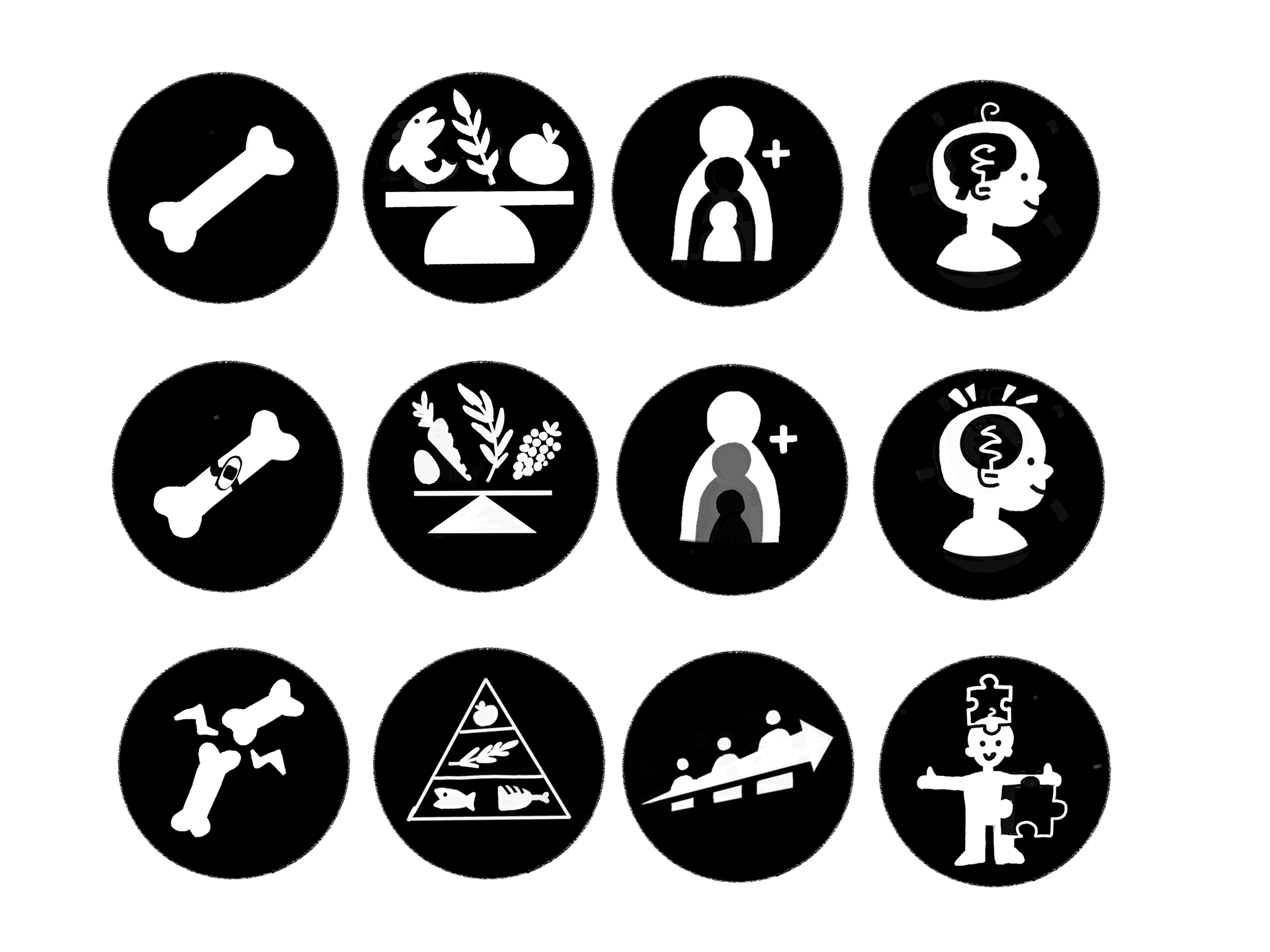
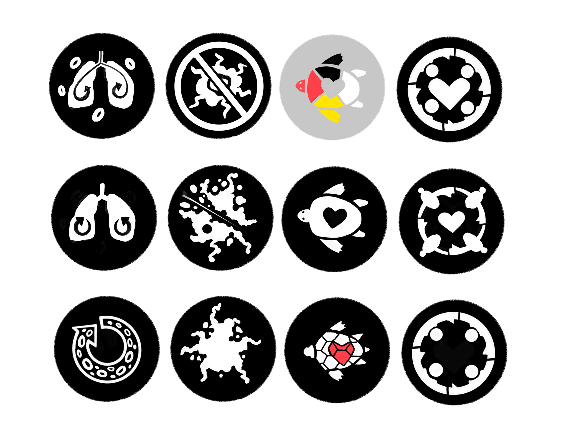
Over the Winter term of 2024, from January to the end of April, I worked at the CIHR as a web development Co-Op student. However, during the term, I was given the opportunity to work on some projects on the graphic design team. The icons below are the result of that work.

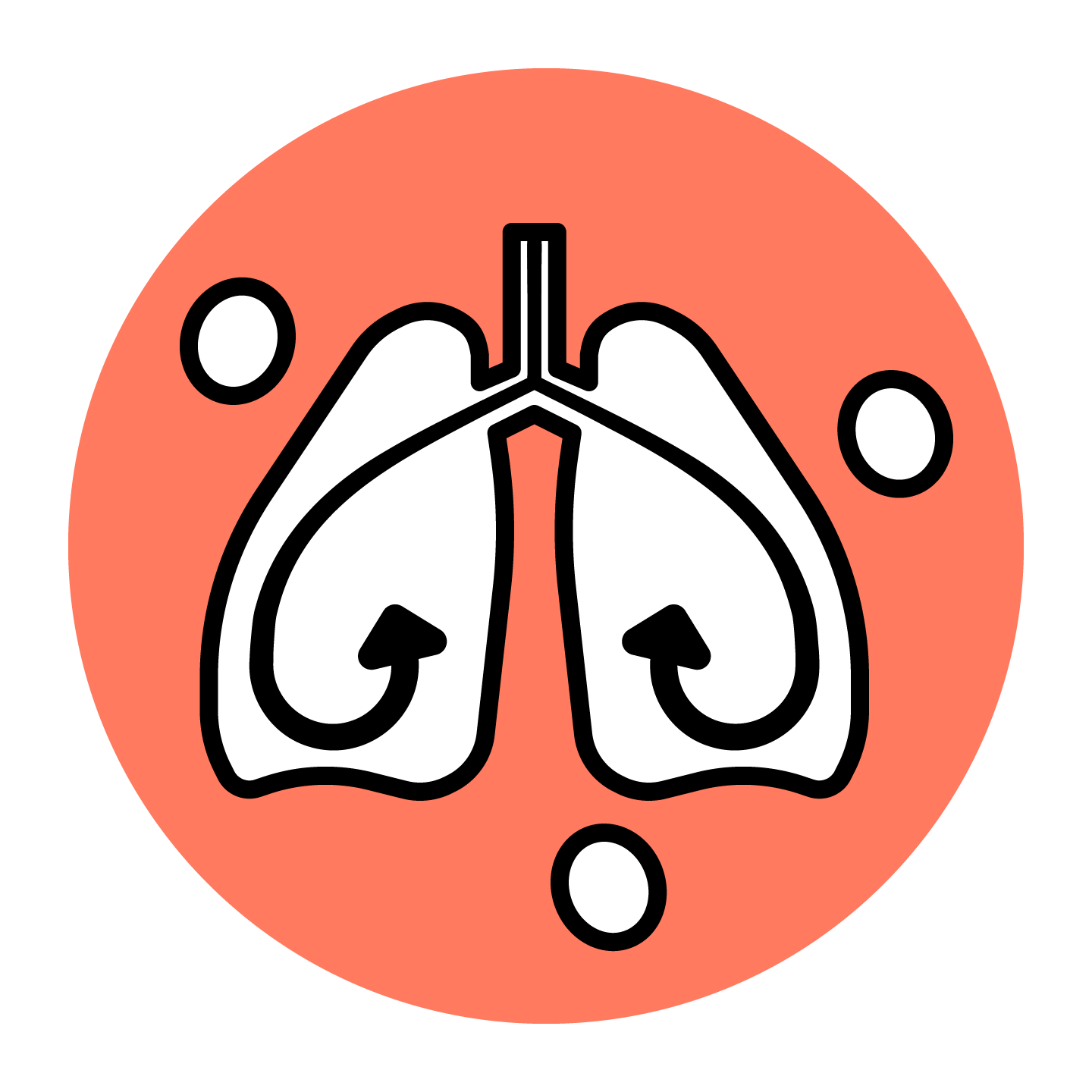


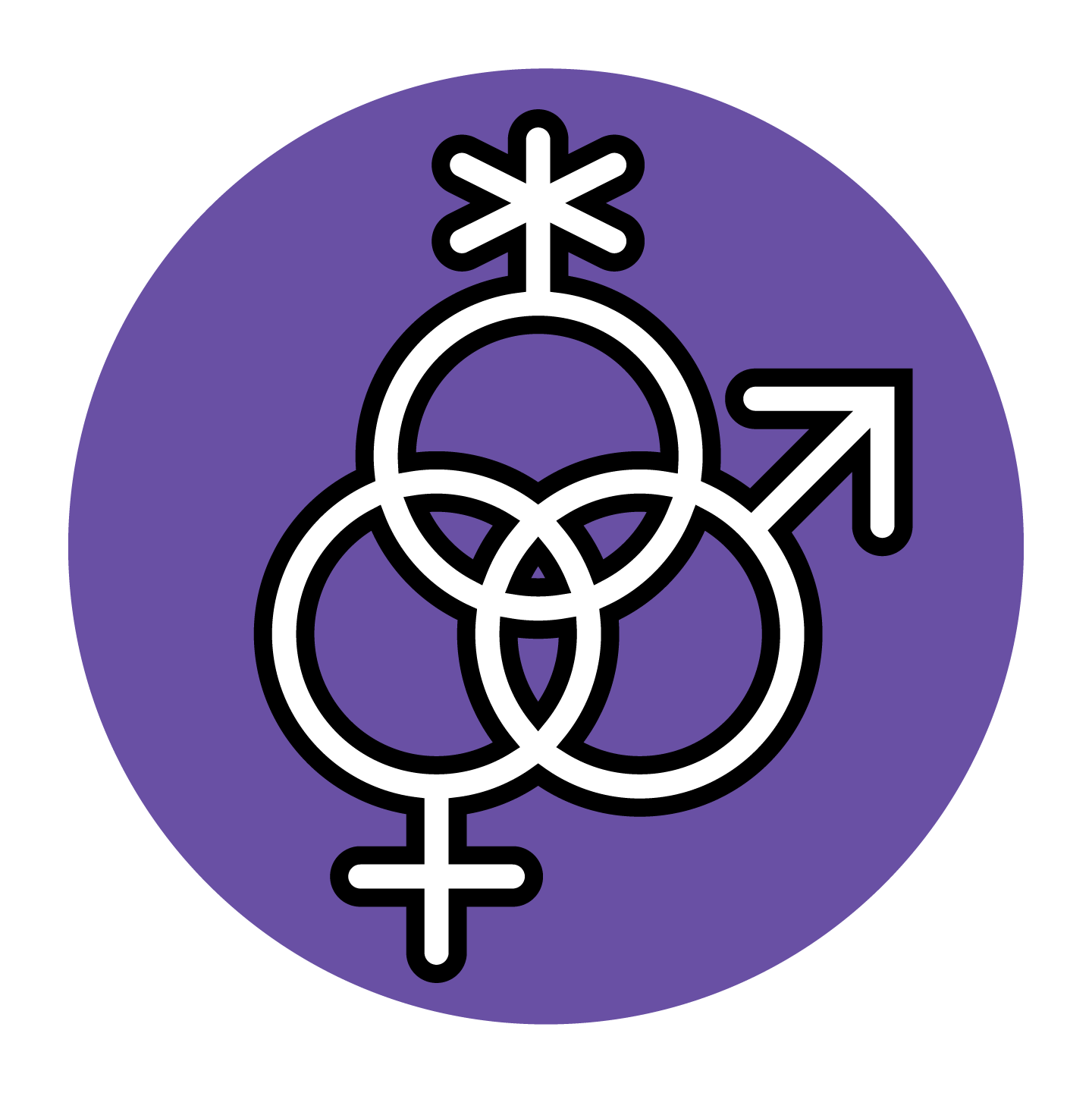
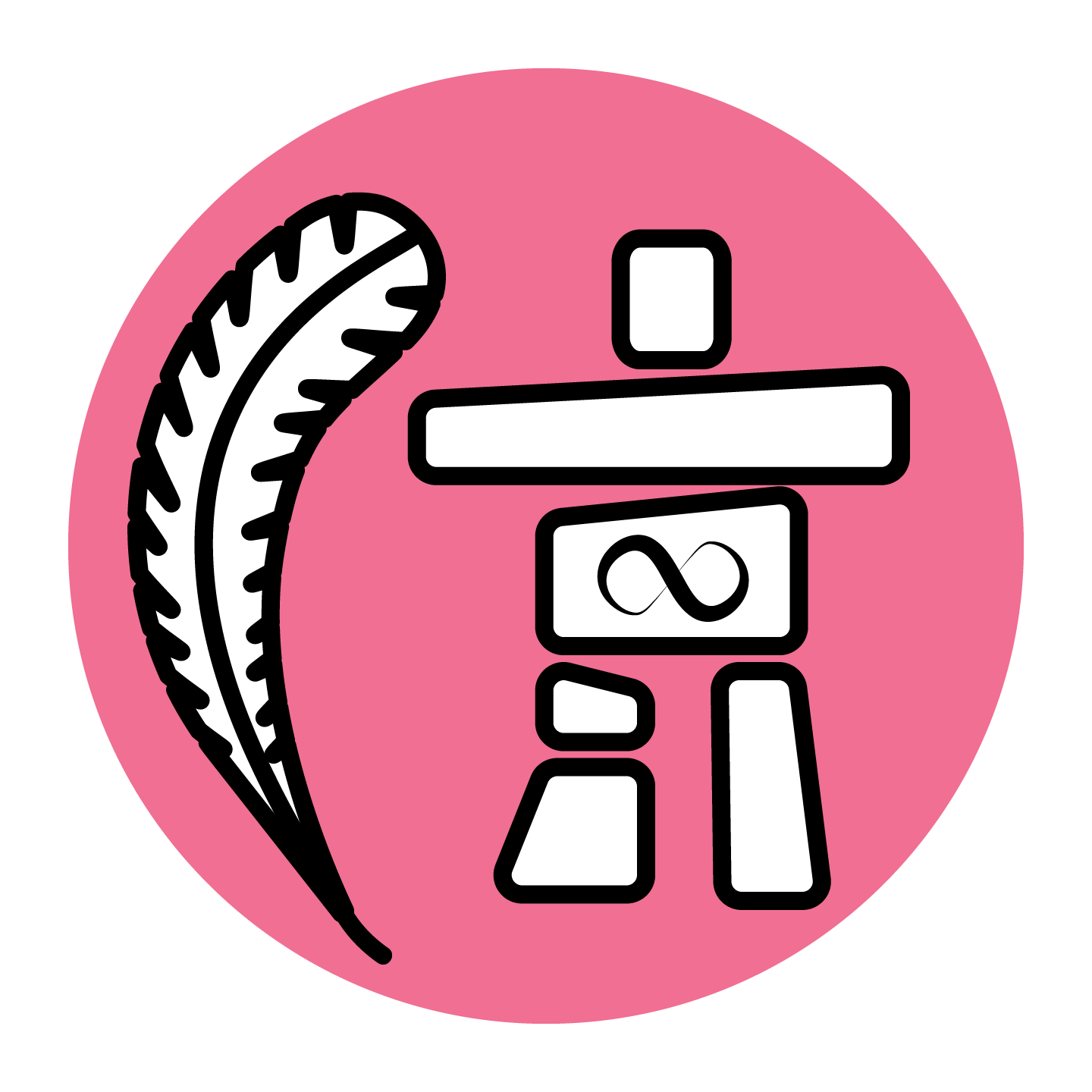


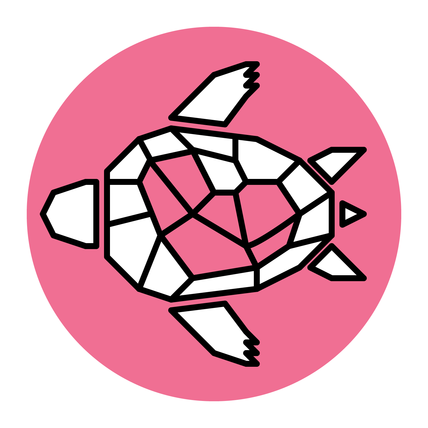
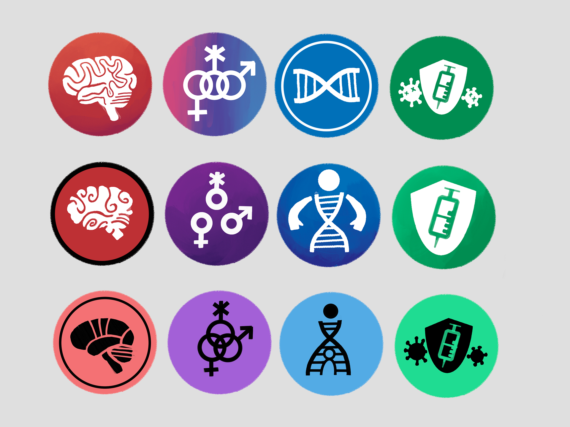
I designed and created over 30 icons and concepts for CIHR, each representing one of the many divisions that make up the institute. I decided to go with a clean, simple design inspired by Pokémon type badges, each with a white or black silhouette on a background in its own distinct colour. I eventually decided to add black outlines to improve definition, as some colours, such as yellow, didn't offer enough contrast with the white background to be visually accessible.
More options
I was asked to create a variety of design options for each division so they could choose the one that best represented their organization.
The 13 divisions are as follows: from left to right,
Infection and Immunity, Circulatory System Health, Public Health, Cancer, Health Institutes, Ageing, Nutrition, Genes, Child Development, Gender Health, Musculoskeletal Health, and Indigenous Health.
Process work
Some early sketches and designs were created in Procreate for each of the icons. I designed and sent many of these to my supervisor for approval before vectorization.
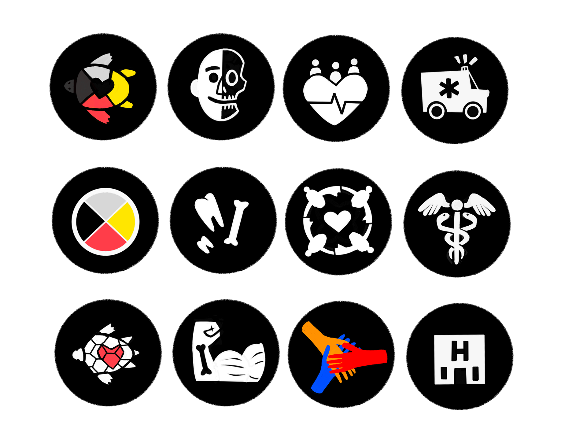
Below you can see some examples of colour styles. If there should be outlines, rings, gradients and more were explored early in development. Ultimately, I settled on solid colour backgrounds with outlined icons as some of them didn't read as easily as pure silhouettes.