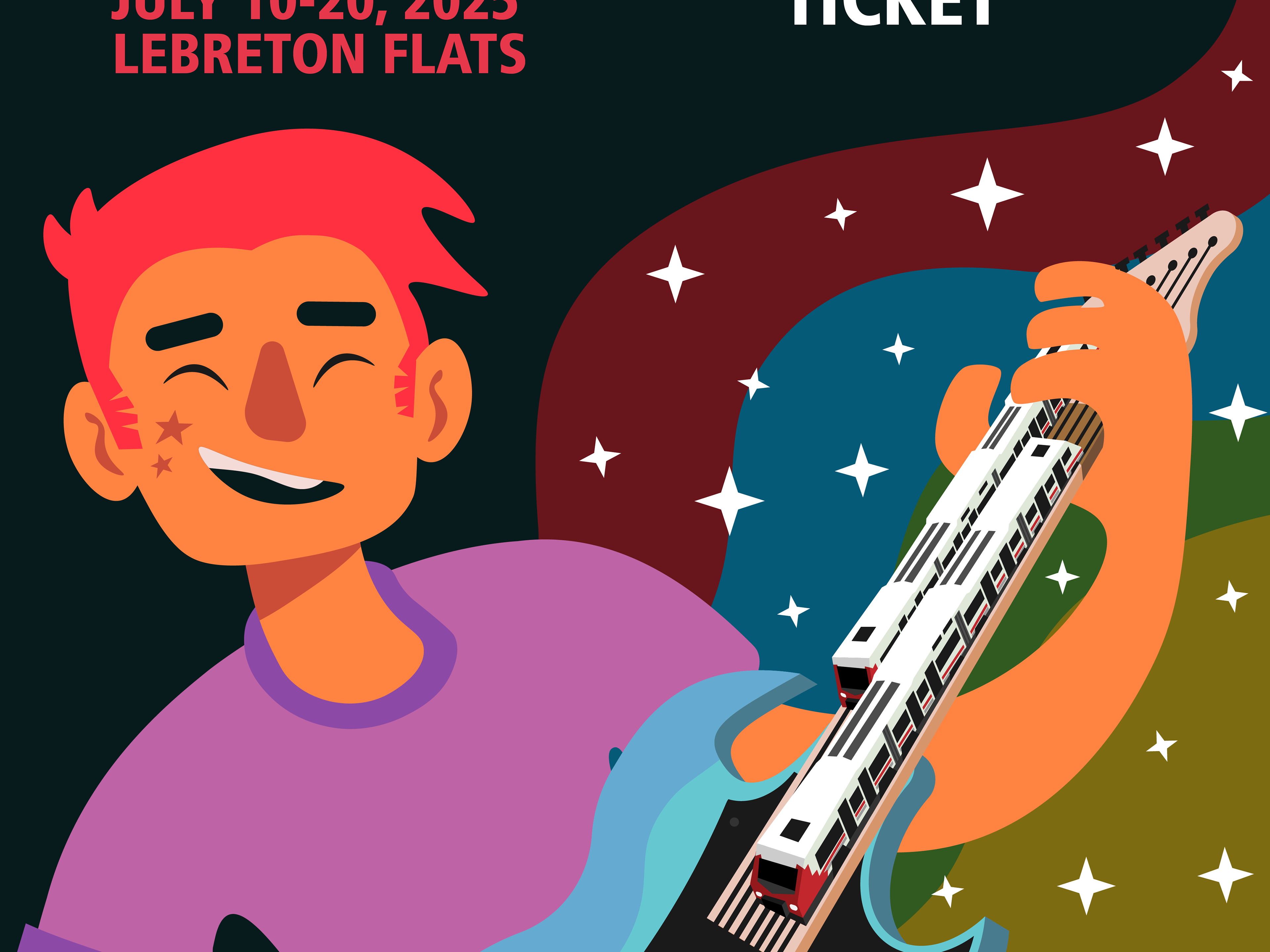
What is My Carleton Events?
My Carleton Events was created as a term project for a UX design and accessibility course. It's a digital bulleting board app, meant to offer a more direct and tailored alternative to other inefficient information delivery methods such as social media, emails and yes bulletin boards. As a student life app, the goal was to help Carleton students get out more often and be more social without the barrier of simply finding something to do.
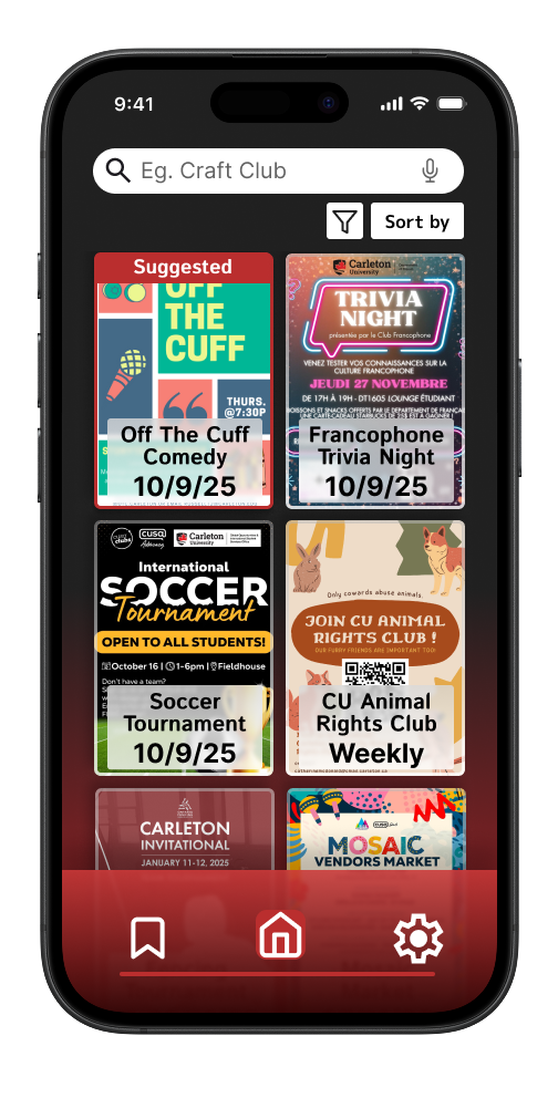
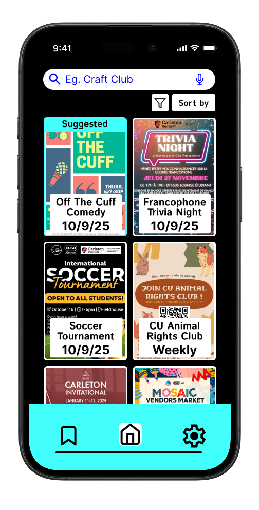
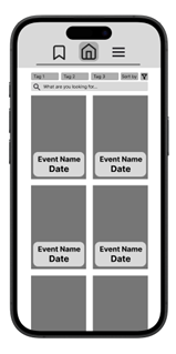
Home page
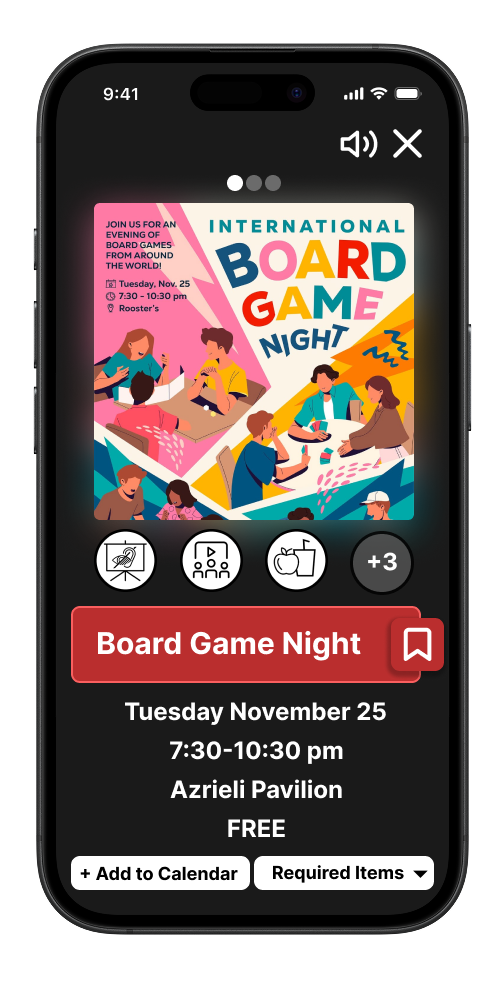
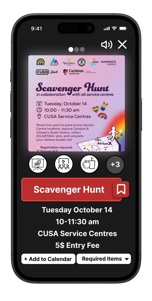
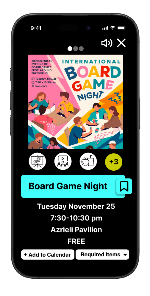
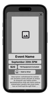
Event Information page
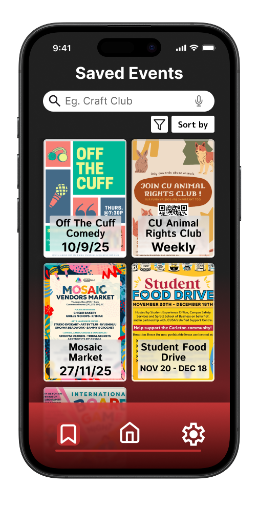
Saved Events page
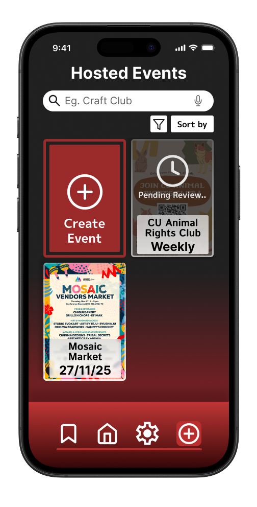
Hosted Events page
Event Information page alt
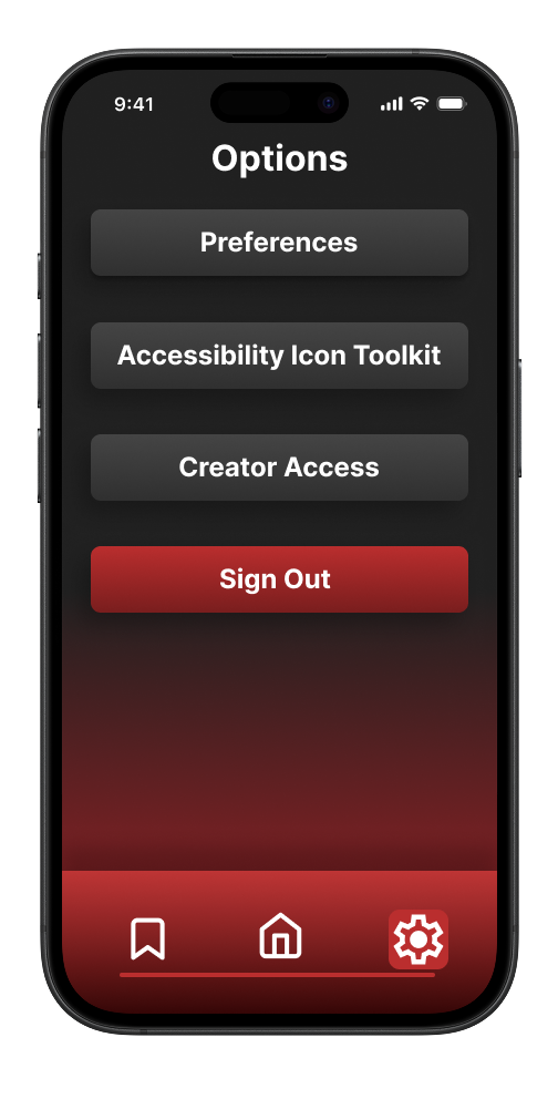
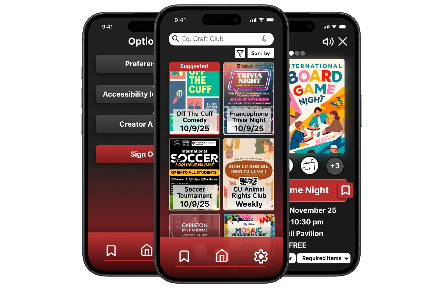
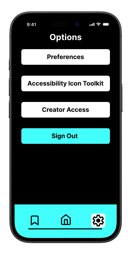
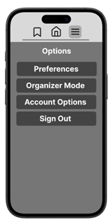
Options menu
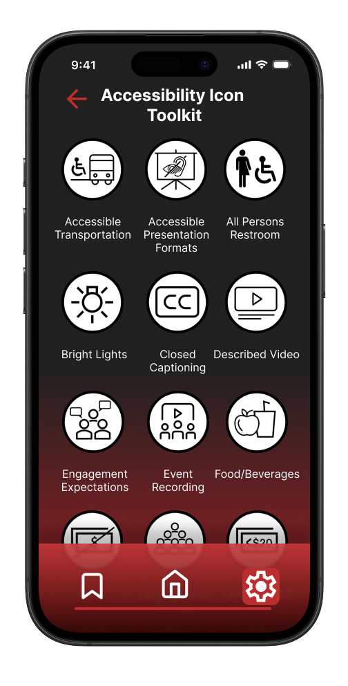
Accessibility Icon Toolkit page
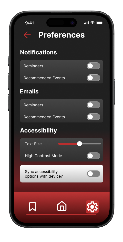
Preferences page
My Role
I worked on a team of 4 people to create the app prototype, roles included research, writing and design, and each of us at least did a little of everything, a good designer always needs to stay informed of users needs and preferences and involved with the user testing in order to design a prototype that serves them properly. While everyone participated in the design aspects of the prototype, I definitely took on a more major role for it.
From the beginning I drafted a simple black and white low fidelity prototype with the concept of simplicity in mind, and I iterated until I reached a polished high fidelity prototype.
I came up with the visual identity of the app and the team carried that through until the end, while the colours were inspired by Carleton University's existing branding, I planned the app layout and visual flair to make it seem more vibrant and modern compared to the existing material.
Methods
A student's life is always on the move and so it was important to us that we designed the app for mobile first as we wanted it to be something that people can access quickly and easily, no matter where they are, or where they are going.
Not only did we want the app to be available always, we also wanted it to be accessible to everyone, we approached this in two ways;
The first was accessibility in the app with features like high contrast mode, dictation and read aloud.
Event information page in high contrast
Home page in high contrast
Options menu in high contrast
The second was accessibility for events, as such we decided to use Carleton's established disability icons as tags so that a user will know if an event is accessible to them right away.
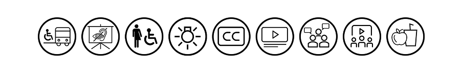
List of Accessibility Icons used by Carleton University and My Carleton Events
Though this may only be a prototype we still wanted to ensure that the design followed WCAG 2.0 and it's principles of being Perceivable, Operable Understandable and Robust
Tools, Skills and Lessons Learned
For our prototype, we mostly used Figma to plan out our design at each stage, as well as the occasional use of Illustrator and Photoshop to create assets, all of which I had a good understanding of before I started working on this assignment. However the context in which they were used, with such a focus on accessibility, was different here, and as such I feel I learned quite a lot.
Our goal was to create an app that applied universal design principles so that it could be used by anyone and that anyone no matter their disabilities or lack thereof they would have a similar experience. This was a real challenge, as we realized pretty quickly that it was not only difficult to get good data for different people with disabilities, simply because there are fewer of them, but also that every person deals with their disability differently.
Our goal was to create an app that applied universal design principles so that it could be used by anyone and that anyone no matter their disabilities or lack thereof they would have a similar experience. This was a real challenge, as we realized pretty quickly that it was not only difficult to get good data for different people with disabilities, simply because there are fewer of them, but also that every person deals with their disability differently.
And so we shifted our approach to design the best we could for the largest group of people, as it's impossible to make the exact same design work for everybody. That realization was one of the main motivators behind choosing to add a high contrast mode, that not only changed the colours to be more accessible, but it also removed a lot of the distracting visual flair that might simply make navigating through the app harder for someone with a visual disability or impairment. Learning how to accommodate for such a wide variety of needs within one design was a challenge, but a welcome one as it gave me the opportunity to learn more about accessible designs and implementation that I will carry forward into my career.
Beyond UX skills I also developed communication and teamwork skills, as I'd never worked in a group with these people before, so learning their process and communication preferences took some time to get right.
Process
Our process followed alternating phases between Research and Development and Design, with each new round of research we gathered useful user feedback that helped us make improvements to our app prototype.
For our first phase we conducted interviews with participants to better understand and identify the problems that they currently experience with existing information delivery systems, and to gain insights into how we could fix them, informing the design of our prototype. Some common themes included; that physical bulletin boards were often cluttered, confusing and physically out of the way or hard to reach for some individuals, and that users preferred digital information formats for convenience and accessibility.
For our first phase we conducted interviews with participants to better understand and identify the problems that they currently experience with existing information delivery systems, and to gain insights into how we could fix them, informing the design of our prototype. Some common themes included; that physical bulletin boards were often cluttered, confusing and physically out of the way or hard to reach for some individuals, and that users preferred digital information formats for convenience and accessibility.
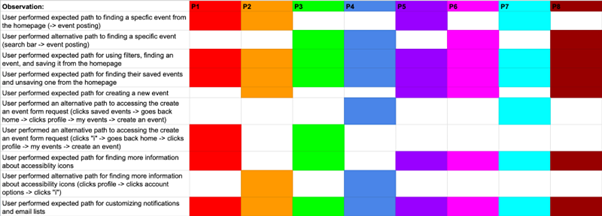
With the next phase we started to conduct user tests and observations where we would ask users to complete a series of tasks and observe how they attempt to complete them. These kinds of observations can give a lot of insights into how a user might be interpreting the design, it's titles, text and layout. Sometimes that means you can clearly tell that a feature is really intuitive and other times you may realize you've made it too obscure or confusing to access.
While general feedback was positive there were several common issues that we noticed and that are visible in the rainbow chart below, namely users had a hard time trying to create their own events.
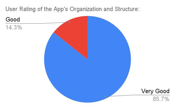
For our final phase of development our main goal was to take common problems like the one mentioned above and to fix them, we also conducted a final round of observations, this time accompanied by an exit interview with the goal of gathering data to see if we had succeeded. We found that for every question asked we received only good or very good as answers, confirming that our changes had improved the overall app experience.
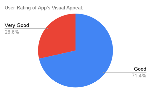
User Rating of App's Visual Appeal